At this point in our lives we’re all quite familiar with our way around PowerPoint. Once we get into the professional world, we’re expected to be able to create killer presentations. We’ve all committed heinous PowerPoint faux pas in our lives, but the time for them to stop is now.
Cal Poly Pomona (CPP) students are lucky enough to have access to Office 365 for free! Login to your CPP email and click Office 365 or navigate here. You can download all three programs at no cost, which includes the latest software updates so you’ll always have access to the newest features.
If you’re working on a group project, you can use Google Drive to collaborate in real time on slideshows, text documents and spreadsheets.
This series will run you through the basics of how to create successful Microsoft Office documents that may help you land your dream job.
The first of our Microsoft Office for Dummies series features PowerPoint.
1. Create an outline
This is one of the points many people fail to recognize when creating a PowerPoint. Most slideshows will accompany a presentation on a subject in which you’ve written an essay. The biggest mistake people make is not creating an outline before they begin creating their slideshow. Start with an introduction slide, then outline the key topics of your presentation; these will serve as the titles of each slide. Your bullet points on your slide should be a summary of support for each topic. Treat a slideshow only as a supplemental tool for your presentation – do not rely on it to teach your audience. That’s why you did all the hard work.

GOOD.
2. Pay attention to good design
There are four key points to good design of a PowerPoint:
- Plain fonts: Do not use any decorative font for a presentation. You may think you’re making your slides “flashier,” but you’re really just distracting from the professional document you’re creating. Stick with sans serif fonts like Arial, Helvetica or Calibri. These are the most easy for your audience to read when projected. And most importantly, stick to no more than two fonts. Using fonts in excess will make your slideshow appear incohesive.
- Contrast: When choosing colors for your slideshow, don’t just pick your favorite colors. Use contrasting colors that will help make your text stand out from the background. Backgrounds that are light or pastel should be paired with a dark colored text. More vivid backgrounds should be paired with white or light text.
- Alignment: AVOID CENTERING. I repeat, avoid centering. Having the text on your slides all lining up on one edge makes it easier for the reader to follow the points of your presentation. It also allows you to find spaces on each slide that can use supplemental images (but don’t go overboard).
- Clutter: The biggest mistake people make on PowerPoint is copying an essay word for word and having huge chunks of text on each slide. Remember, your slideshow is supplemental to your presentation. Pay attention to your outline, and focus on using three to five bullet points per slide, and one to two lines each.


BAD
3. For time sensitivity, use a theme
If you’re in a crunch, or you just have no idea how to follow step two, use one of the themes built into PowerPoint. The themes are designed to provide plain fonts, contrast, alignment and clutter free slideshows. They even adjust the font size to fit the content of your slides, but keep in mind the three to five and one to two rule about bullet points.
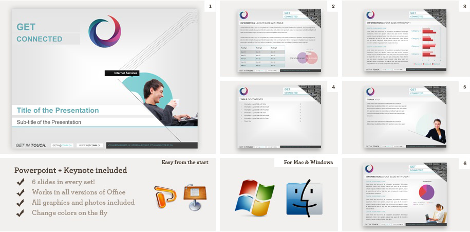
GOOD
4. Use images sparingly
Images are a great tool to use to attract viewers to your slideshow, and help compliment the information you’re presenting. But remember these are slides, not collages. Balance slides that don’t contain a lot of text with one to two photos per slide at most. If you want the photo to be large, put it on it’s own slide. PowerPoint themes will even have designated areas for you to put a photo and it will resize the images for you.

BAD
5. Interact with your audience
When you design your slideshow, take note of slides or images that might need more explanation. This gives you a break from lecturing, and gets your audience engaged. If you hate public speaking, this is also a great way to pull attention from yourself while you’re presenting.

GOOD
What tips from this list will you use in your next PowerPoint? Let us know using the hashtag #CampusCropChat on Facebook, Twitter and Instagram, and don’t forget to follow us on Snapchat @asicpp!